Magazines are such an abundant resource, they are within arms reach at the convenience store, the doctor’s office, and even on airplanes. With them all around us, it is probably taken for granted the work that goes into them. Just design alone must take hours, not to mention the other content. With this in mind, I would like to examine a two-page magazine spread and point out elements of design within it.
The spread I chose caught my eye and, unlike many of the magazine spreads I saw, is free of offensive material. I want to look closer to discover why this spread caught my attention.

I searched long and hard to find the original source of both this image and the actual article with no luck. I did find quite a lot of information on the individual pictured. His name is Alex Honnald. He is well known as a free-solo climber, a rock-climber that does not use ropes. He has been featured in the National Geographic magazine, CNN, the New York Times, and many other notable areas. He also has a film about him and his biggest climb called Free Solo. Pictured on the ledge of Half-dome, it is easy to understand why he is so interesting to the public.
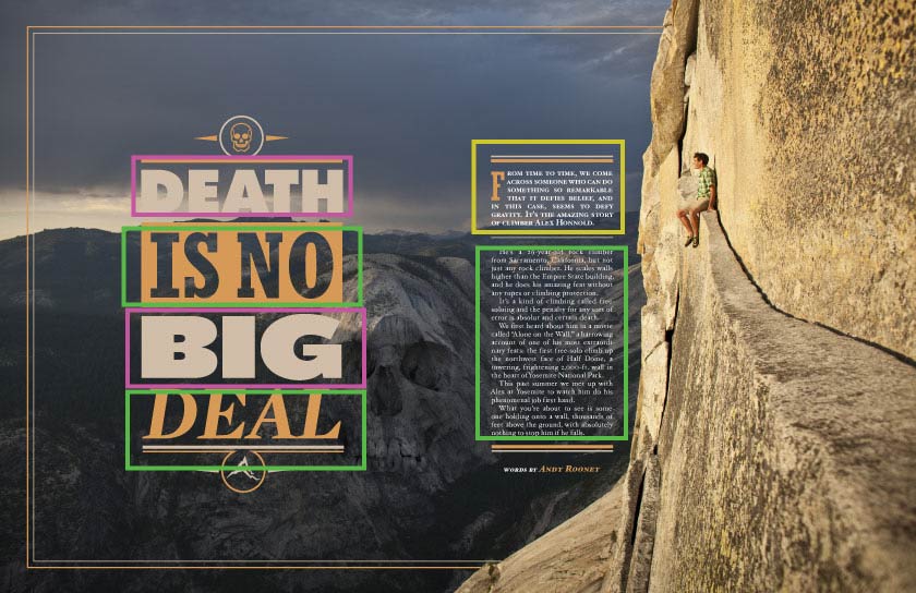
The designer of this spread used two different typefaces, each from a separate type family. The type boxed in pink is a sans serif font. The type in the upper green box is slab serif while the lower green box is a semi-modern font. On the right hand side, where the main text is, the yellow box is the semi-modern font. The green box is also semi-modern. The contrast between the serif fonts work well while also being different enough to cause interest and variety.

The placement of objects within the photograph follow excellent photo design elements. The rule of thirds has been well executed: The large text is on the first vertical line and hits two intersecting points. The skull is almost situated on intersecting points and the man is also near an intersection. The horizon line follows the upper horizontal line and the scenery is also broken in two along the second horizontal line. Most importantly, the rock face of half-dome takes up one third of the photo. The heavy text on the left, as well as the background mountains, balance the weight of the scene. The crack along the ledge leads directly to the subject of the scene, guiding your eye to the main message of the piece.
My attempts to imitate the design.
To really appreciate and understand the magazine design I tried to take photos that fit the same major elements of design as the magazine spread. I found this to be much more difficult than I imagined.


After this experiment I am left with an increased sense of respect and admiration for this designer, and designers in general. I wish I could properly give him/her credit.
 Lovely Notes