I wanted to recreate an ad I found so that it would fit into a series of similar ads. This helps me to really study the design of an ad as well as test my ability to use my limited Photoshop skills.
Here is the original ad. I love the shock factor it has by placing the faces where you don’t expect them, and the message is great too.
This ad was created by Vladmir Jones, aired December 2015, and posted to adsoftheworld.com Februarary 24, 2016. It is titled Parent Fearlessly, 1. It was part of a campaign of the company Bright By Three.
Here is my attempt at an ad that would fit into the same campaign.
While recreating the ad I noticed design elements which I then emulated. The original ad uses two different types of…type. One is a san serif, which was used in a narrow form and bold; the other a script. The text boldness increases from the top down, adding emphasis. The banner in the left hand corner was really difficult to make, I just had to go with something similar. The alignment in the ad is clean and refreshing, I tried to mirror that as well.
Magazines are such an abundant resource, they are within arms reach at the convenience store, the doctor’s office, and even on airplanes. With them all around us, it is probably taken for granted the work that goes into them. Just design alone must take hours, not to mention the other content. With this in mind, I would like to examine a two-page magazine spread and point out elements of design within it.
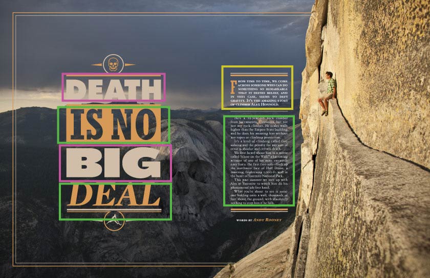
The spread I chose caught my eye and, unlike many of the magazine spreads I saw, is free of offensive material. I want to look closer to discover why this spread caught my attention.
I searched long and hard to find the original source of both this image and the actual article with no luck. I did find quite a lot of information on the individual pictured. His name is Alex Honnald. He is well known as a free-solo climber, a rock-climber that does not use ropes. He has been featured in the National Geographic magazine, CNN, the New York Times, and many other notable areas. He also has a film about him and his biggest climb called Free Solo. Pictured on the ledge of Half-dome, it is easy to understand why he is so interesting to the public.
Typography The designer of this spread used two different typefaces, each from a separate type family. The type boxed in pink is a sans serif font. The type in the upper green box is slab serif while the lower green box is a semi-modern font. On the right hand side, where the main text is, the yellow box is the semi-modern font. The green box is also semi-modern. The contrast between the serif fonts work well while also being different enough to cause interest and variety.Rule of Thirds and leading lines. The placement of objects within the photograph follow excellent photo design elements. The rule of thirds has been well executed: The large text is on the first vertical line and hits two intersecting points. The skull is almost situated on intersecting points and the man is also near an intersection. The horizon line follows the upper horizontal line and the scenery is also broken in two along the second horizontal line. Most importantly, the rock face of half-dome takes up one third of the photo. The heavy text on the left, as well as the background mountains, balance the weight of the scene. The crack along the ledge leads directly to the subject of the scene, guiding your eye to the main message of the piece. My attempts to imitate the design. To really appreciate and understand the magazine design I tried to take photos that fit the same major elements of design as the magazine spread. I found this to be much more difficult than I imagined.I feel like this one turned out well. The right third of the scene is dominated by the log with the crab acting as the main subject. The horizon line is a third of the photo and so are the logs and the sand. I am quite pleased with it and feel it could be substituted in place of the original photo and still match the design well.I really tried to catch the prominent subject element of the design. I placed the subject, the crab again, in the same area as in the magazine and used the abalone shell in place of the skull. While the water does make an okay horizon line, and the kelp makes a looming foreground structure, the rest of the design is really not that comparable to the magazine.This photo definitely has a clear subject. There is also three layers of depth like in the magazine. The other defining elements are missing.
After this experiment I am left with an increased sense of respect and admiration for this designer, and designers in general. I wish I could properly give him/her credit.
This is an advertisement for the Stasher Bag. It is pleasant to view and communicates a clear message. Let’s take a look at the design principles of alignment, proximity, repetition and color, and contrast and how they have been applied to this advertisement.
Stasher Bags are silicone pouches with resealable tops that are made to hold food. Similar in style and function to plastic Ziploc bags. The difference is the impact they have on the environment. Unlike Ziploc bags, Stasher Bags can be used repeatedly. They are also freezer, dishwasher, microwave, stove, and oven safe. This makes them very versatile. Because they are made from food grade silicon, there is no need to worry about plastics leaching into your food. Alignment The bags are laid out in very straight rows and columns. These form clean edges. The text on the bottom of the image is the same length as the grid and also the same distance from the bags as the bags are to each other. The upper text is also an equal distance from the bags. The text is centered and even.
Proximity The text and the bags are equally distant from each other, this demonstrates their combined purpose. The texts unifying color shows that they are related, each providing product description. The colors of the bags are evenly distributed and thus, evenly viewed.
Repetition and Color The colors are bright and happy. They add a fresh, vibrant appeal to the design. In addition, the colors are distributed evenly and provide a path for the eye to follow. The colors are not washed out or muted, they pop off the background with wonderful contrast.
Repetition of the colors help to unify the piece. The descriptive text also repeats in the same font and color at the top and bottom, keeping the style consistent. The columns and rows form a repeated pattern. Citrus is placed in both the 3rd bag from the left and also the furthest to the right in the second column.
Contrast The white background contrasts with the brightly colored bags. This really helps the viewer to focus on the product being advertised. “Stasher” is in bold and also a larger font size, this emphasizes the product title. The use of dark text contrasts well with the bright background. It is very easy to see.




 Lovely Notes